Art Direction, Branding, Implementation, UX/UI, Visual Communications, Web Design
Banfield Intranet Refresh
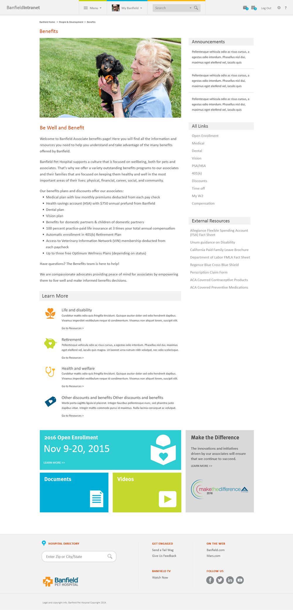
The original Banfield Pet Hospital intranet was very limited. It was hard to navigate, information was hard to find, not searchable, and associates didn’t want to use it. In partnership with the internal communications team and in-house developers, we built a best-in-class intranet named Fetch (by a whopping 90% of associate votes). I was responsible in bringing the intranet to life — working closely with the content and developer teams customizing each page for the best associate experience.

Built for 18,000+ associates across 1,000+ pet hospitals in the United States, Puerto Rico, and Mexico.
Building the Intranet
I was one of three on the specialized team formed for the launch and maintenance of Fetch. With an agency providing the initial art direction and design system, I led the design implementation customizing each page and creating templates for real use cases, content, and people.

I collaborated with the SharePoint developers providing wireframes, pixel perfect screens, user interface design, consulted on user accessibility, built a visual design system, and on-going graphics. Made decisions to improve the visual look and feel, incorporating brand updates, and creating custom new pages based on feedback.

I partnered with the business to finalize copy, designed supporting visual communications, created templates for company campaigns for the communications team, training workshops for super users, user guides, and creating over 1000+ image graphics, icons, and other assets as needed.


Launching the Intranet
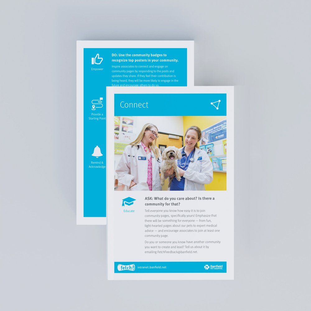
It took the better part of a year preparing for go live. As part of the internal communications strategy to launch Fetch, I partnered with the project manager and content writers to design conversation cards to engage the hospital teams. A box was sent to each hospital with fun crafts and backgrounds for team selfies which were highlighted on the intranet homepage with accompanying articles.

After launch, we continually improved the intranet based on feedback, analytics, and user experience surveys. We built a new Resource Library for associates to find documents faster and easier. I trained super users on metadata inputs and making documents searchable.
My Role
Led the branding, user experience, and interface design of the intranet in collaboration with the project manager, IT developers, and internal communications team. Maintained the intranet with continuous improvement, created templates, and trained super users.
Art Direction
Branding
Implementation
UI/UX
Visual Communications
Web Design
Design System: Blue Rooster
Outcomes
Improved associate usage over 1000% because it was intuitive and easy-to-use
Associates could find relevant hospital documents 80% faster
Operation teams were able to share information quickly and visually
Associate engagement increased significantly through promoted recognition programs and shared interest communities
Business partners overjoyed with personalized pages and self-service templates
